


Somewhere around act two of How to Lose a Guy in 10 Days, Andie Anderson is bringing over stuffed animals, giving Ben a digitally created baby book he never asked for, and showing up to his poker night uninvited with a basket of bath products labeled “his and hers.” She is doing it on purpose. It’s for a magazine assignment. She needs Ben gone by day ten and she is committed.
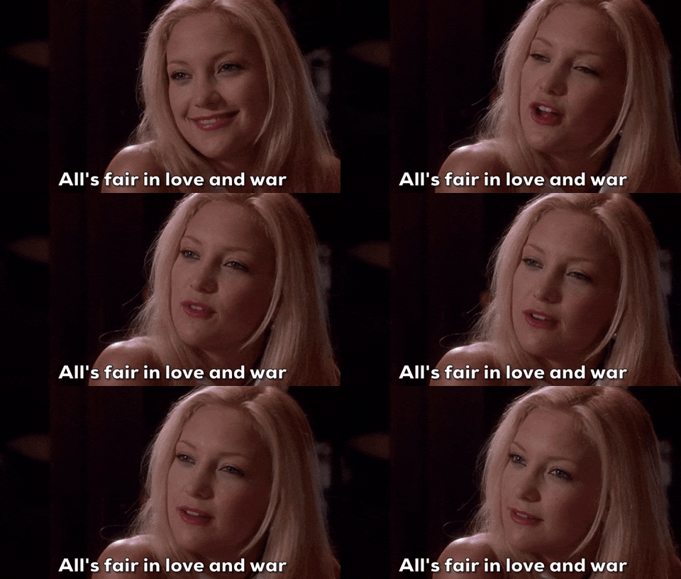
Here’s the thing though…you don’t need a magazine assignment to pull an Andie Anderson on your subscriber list. Most businesses are doing it completely by accident, with total sincerity, thinking they’re being a good, attentive, likable presence in someone’s inbox.
Meanwhile the subscriber is quietly backing toward the door the way Ben did every time Andie was being “crazy”.
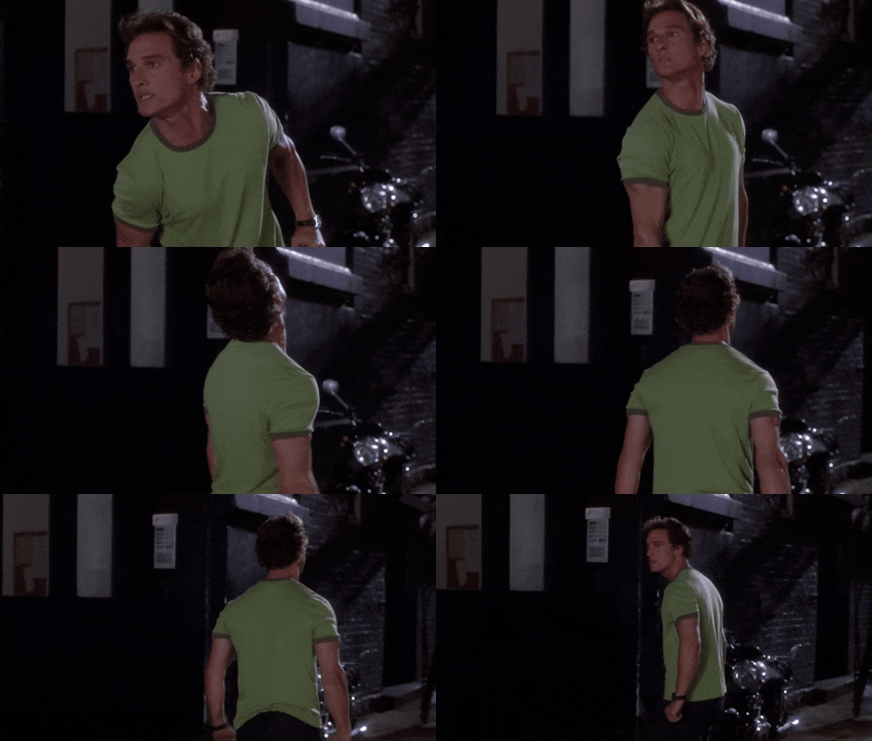
Here’s the other thing. It’s almost never the writing. I subscribe to so many founders with brilliant things to say.
It’s the five things happening around the writing, the equivalent of the dead fern and the uninvited poker-night appearance, that quietly convince someone to swipe left on a business they actually liked.
The five ways you’re Andie-ing your list

Mistake one: no photos of you.
If a new subscriber can’t picture the human on the other end of the email, especially in that first welcome sequence, there’s no one to build a crush on. Logos, illustrations scraped from google and stock photos are a stranger at the door. A real, well-lit photo of an actual person is the person actually answering the email so introduce yourself!
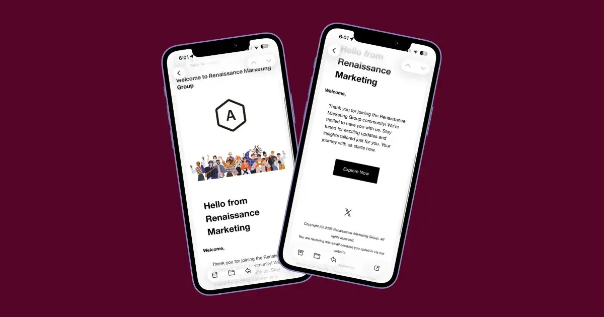
Mistake two: the wall of text.
This is the group-hang monologue. No hierarchy, no white space, no clear place to jump in, just paragraph after paragraph asking the reader to keep up. Your subscriber tunes out around the third unbroken paragraph.
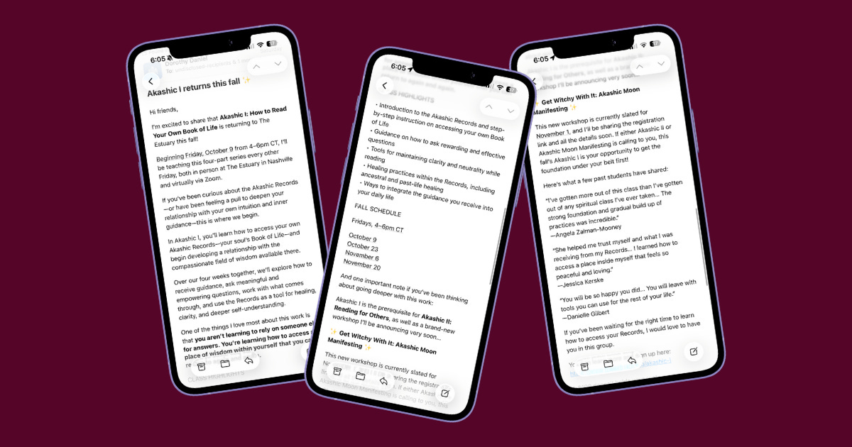
Mistake three: not built for mobile.
Text running edge to edge, a skinny column that forces sideways scrolling, links so faint you’d need editor instincts to spot them...Oh my! Most of your list is reading you on a phone, standing in a kitchen, half paying attention.
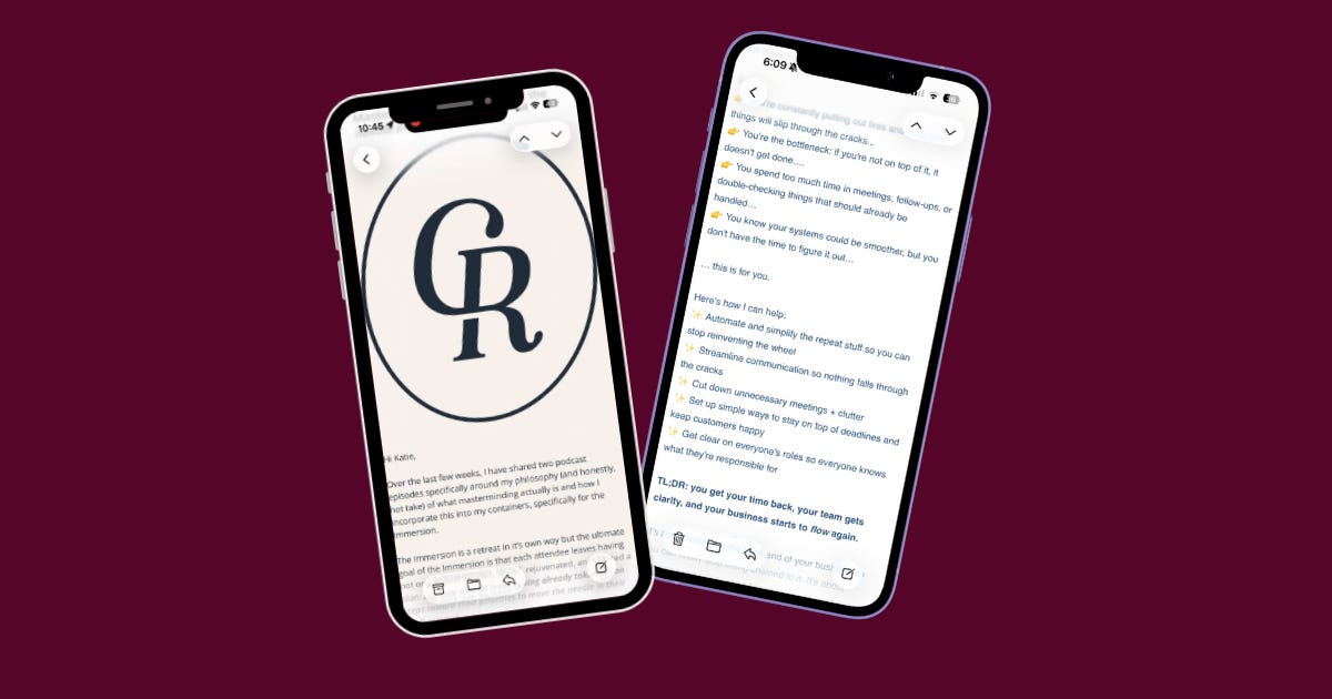
If it’s uncomfortable to read there, it gets the same fate as that dying love fern: closed, deleted, never spoken of again.
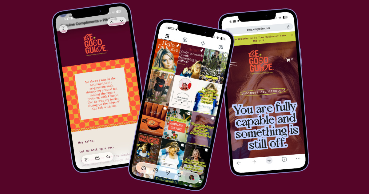
Mistake four: an identity crisis.
The email doesn’t sound, look, or feel like the same person your subscriber followed on Instagram or found on your website. It’s the equivalent of Andie showing up as three different women depending on the assignment: aloof at the restaurant, cool at the Mets game, a complete psycho by poker night. Every mismatch costs a little trust, because somewhere in the back of the subscriber’s mind, a small voice is asking, wait, is this the same person?
Mistake five: an unclear CTA.
Three buttons, three different phrases, all pointing at the same place, plus a link list at the bottom just in case.
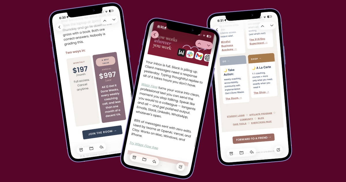
It feels generous, but it’s actually just a lot of pressure with no clear ask. It can also feel like homework instead of helpful. If you are launching a new product line? Totally fine to link to several of the products. That is more like a collection of things. Telling someone to take 15 actions that all are shouting at the same volume is a bit much.
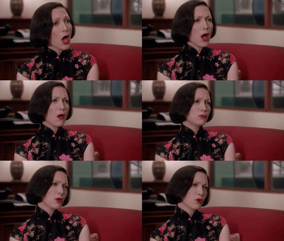
These are just a few examples of the exact playbook for getting dumped. When it comes to email, design isn’t just about visuals. The ability to scan quickly and then go deeper and actually read the words you’ve spent time on is important.
We can spend so much time on sales pages and instagram and every other front door to our world. But what about the people who have already raised their hands to read your words? Let’s not leave them hanging. They deserve the same 5 star treatment!
The five-minute fix
Not tech-savvy or don’t have a design eye? That's exactly what Inbox Glow-Up is for. It's a done-for-you Flodesk email system built from whatever brand you already have, delivered in under two weeks. Because you shouldn’t have to have a design degree to make your content accessible. No starting from scratch, just your actual brand finally landing the way it should in someone's inbox.

