3 Substack Features I’m Using to Upgrade My Posts (Without Overcomplicating Them)
Small shifts that make your content feel more intentional, more branded, and easier to create consistently
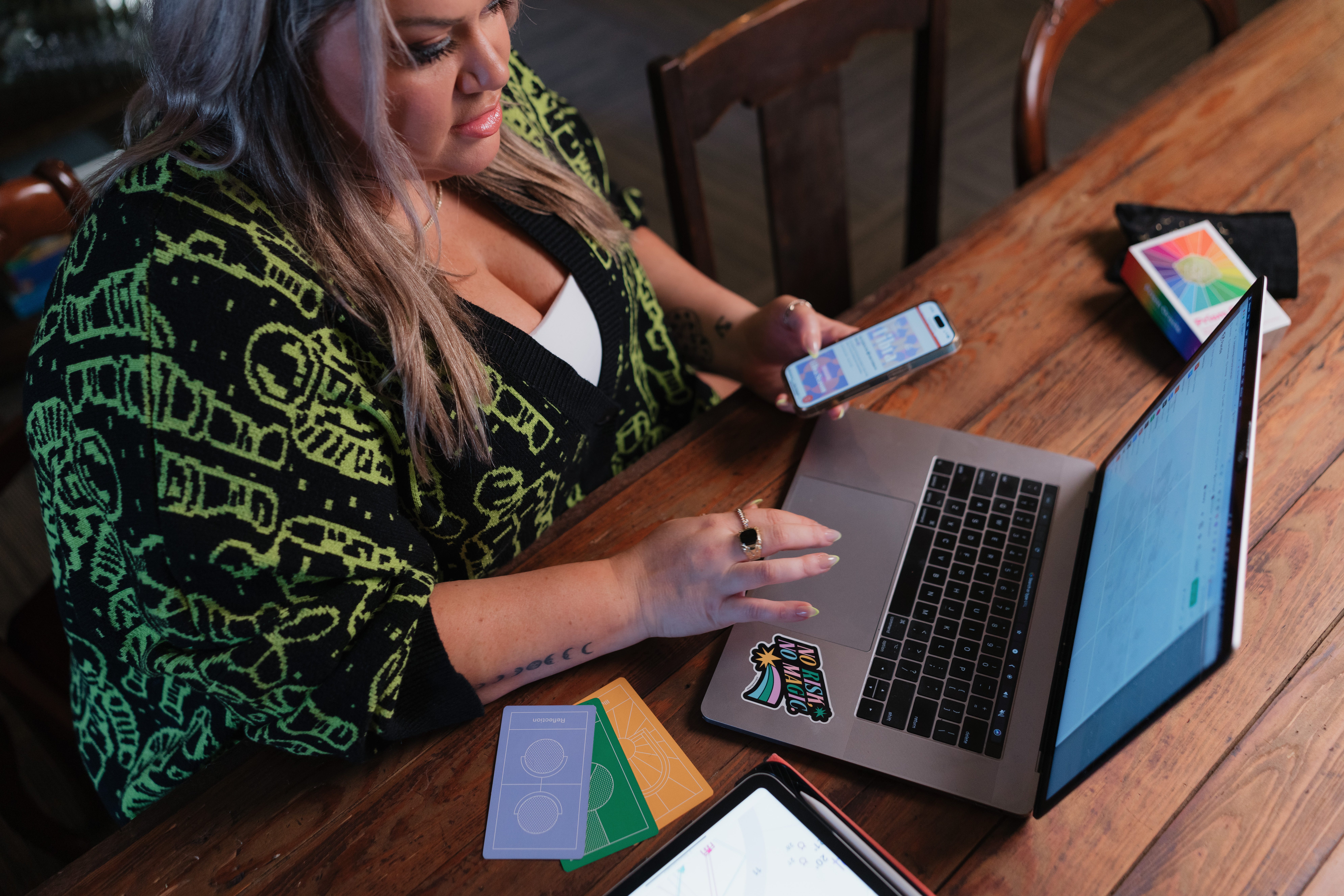
I’ve been spending more time inside Substack lately, both writing and helping clients think about how they want their content to feel, not just what they want to say.
And one thing I keep coming back to is this:
Most people are treating Substack like a blank Google Doc.
Which works… but it’s also leaving a lot on the table.
Because what Substack is quietly becoming is much closer to a publishing platform, not just a writing tool.
And coming from my background in media and product, where I was designing platforms used by editors at places like Cosmopolitan, Marie Claire, Esquire, Car and Driver, Road & Track, and dozens of other global titles, I can tell you:
The way content is structured, designed, and experienced matters just as much as what’s being said.
Back then, we were experimenting with multimedia, polls, and different content formats at scale, and it was honestly way harder to implement back then.
Now, a lot of those same ideas are available to you inside Substack… in a much simpler way.
So I wanted to share a few features I’m personally using right now that are making my posts feel more intentional without adding a ton of extra work.
1. Templates (this is the one most people are underusing)
Which is probably because it’s brand new! The new template feature is probably the most immediately useful update if you’re publishing regularly.
Instead of rebuilding the same structure every time, you can create a repeatable layout that already includes your core elements.
For me, that looks like:
my divider graphics (the horizontal lines that match my branding)
my signature sign-off
a copyright section at the bottom of each post
and any recurring formatting I want to keep consistent
Before, I was dragging these in manually every single time, which is not hard, but it’s enough friction that it either slows you down or gets skipped when you’re in a rush.
Now, it’s just… there.
It sounds small, but this is the kind of thing that:
keeps your posts visually consistent
reinforces your brand without extra effort
and makes publishing feel lighter instead of repetitive
If you’re posting regularly, this is one of the easiest upgrades you can make.
2. Bringing your brand into the post itself
This is something I don’t see talked about enough. Your Substack doesn’t have to feel like a plain document.
You can decide:
does this feel like a diary entry?
does this feel like a magazine article?
does this feel like a coffee table book?
does this feel like a private voice note with visuals?
The way you use:
dividers
spacing
images
formatting
tone
…all contributes to that.
For me, adding simple branded dividers completely changed how my posts feel. It gives structure, creates visual pauses, and makes the whole thing feel more considered.
And because I’ve now built that into a template, I don’t have to think about it every time.
If this is something you are into, you may want to check out how I’m doing this on Instagram as well:
3. Multimedia (this is where things are going)
I really believe multimedia is the future of Substack. Not in a “you need to turn every post into a full production” way, but in a “not everything needs to be paragraphs” way.
Some of the things I’ve been leaning into:
adding audio notes inside longer posts
thinking about where a visual would communicate something faster than text
breaking up dense sections with something more interactive or sensory
When you’re writing longer pieces, audio in particular is powerful.
It gives people another way to engage.
It adds tone and nuance.
It makes the content feel more personal.
And again, this is something that used to be much harder to implement in traditional publishing environments.
Now it’s just… available.
The bigger shift
All of this really comes back to one question:
What do you want it to feel like to be inside your content?
Not just:
what do you want to say
or how often do you want to post
But:
what is the experience of reading, listening, or engaging with you?
Because that’s the part people remember.
And the good news is, you don’t need a huge team or complicated tech stack to create that anymore. A few thoughtful decisions, a simple template, and a little intention around format go a long way.
Make it feel as good behind the scenes as it looks from the outside.
© 2026 Kmac LLC. All Rights Reserved.


Completely yes to all of this, Katie. The visual aspect is so important in how we consume information. And when you repeat it, people come to your piece already feeling comfortable because they know what to expect. Which means they understand it more, embody it more, trust it more (trust you more).
One of the things I started doing was creating Pinterest worthy images. Ones that could be saved for reference. Calling out something in the written text, and putting it into an image. Sometimes it's steps, a graphic, or inspirational quote. Plus they become the images I pin on my Pinterest boards (and that's how I decide the size format).